Monday, December 12, 2011

Best Covers

#1- Informal
#2- Informal
#3- Informal
#9- Informal
#10- Formal
#13- Informal, Environmental
#15- Informal
#18- Informal, Environmental
#19- Formal
#21- Informal, Environmental
#22- Formal
#23- Informal
#24- Informal
#26- Formal
#27- Informal
#28- Informal
#29- Informal
#31- Informal, Environmental
#32- Informal, Environmental
#35- Informal
#36- Formal
#37 (1st Tie)- Formal
#37 (3rd Tie)-Formal
#37 (5th Tie)- Formal

#3
Favorite
This magazine stood out in particular to me. The way the photo speaks without speaking, and how it conveys a message about Muhammad Ali directly, made it stand out past all other photos. The arrows in his chest and his legs, look real enough but not actually real, but they still give the message of what the article or the magazine might be about. Following the properties of a magazine cover, it fulfills having its recognizable brand, pulling at the emotions, making me curious about the article as well as intellectually stimulating my thoughts. As well the light is even, and the back drop is white, a benevolent color, along with his shorts. This magazine cover appeals to me, and if I had it in hand I would read its relating article thoroughly to fulfill the curiosity that it gave me.

Best Mural Photo

My Best Self-Portrait

Green Hall, Western Staircase


Thursday, December 8, 2011

Lytro Warm-up

1) In the photos, when I would click on different objects and areas of the screen, the clarity of certain areas would change. The photos focus would change even though its only one take of a photo.

2) This new camera would change it's focus according to different areas and objects on the screen that have been clicked. It is able to take "living pictures," which is defined as a picture detecting and processing a large amount of the light field to get the most amount of light and colors in the photo.

3) Since there is no specific control over aperture, shutter speed or ISO, the photographer has to be very aware of the amount of light present in the shot, as well as the action being taken.

4) Looking at the prices online, its about the same price as the cameras we use in class. To me, it doesn't seem very worth it. You can get a variety of other different sorts of photos. Also, since you can adjust what is focused after the picture is taken, in my mind it seems a bit like cheating to have this ability. Part of the appeal of photography to me is being able to easily set a specific focus on a subject, or to capture something worth viewing.

Tuesday, December 6, 2011

Rules of Photography Part II


Rule of Thirds

Balancing Elements
Leading Lines

Symmetry

Viewpoints

Background

Depth

Framing

Cropping
Merger

Friday, December 2, 2011

Self Portraits and Portraits Part II

Some of the most helpful tips I found:
"Think about your motivation and emotions: Blankly staring at the camera rarely gets good results. Be silly, don’t be afraid to over-act. The worst that can happen is that you fill up your memory card with useless photos; but you might also find yourself with a proper gold-nugget of a self portrait."

"You can create an especially revealing self-portrait by adding personal memorabilia surrounding your mirrored image, such as photos of yourself at various stages of your life, or anything that tells the viewer about your interests. Besides a mirror, a window can sometimes offer a reflective surface for you to capture your own image."

"Whenever you are photographing someone, try to think of details of their body or dress that would get your message across in an indirect way."

I like this photo because of the environment, and the balance between the environment and the subject. He isn't doing anything but the environment around him tells something about him.

This photo is cool to me because it captures the main in his element, where he might be spending most of his time. The certain effects on the photo like the darker appearance of the man's environment puts more focus on the photographer to balance out the amount of environment.

I really like this photo because of the effect of the wire, and the lack of focus on the subject's face, and the choice to focus on her hand more than anything else.

I really like this portrait because of it's simple nature but also because the man in the photo and the attachment on the camera look interesting, and it definitely captures the photographer in his element along with his tool.

I really like this simple portrait because of it's simplicity, and its lack of any other subject but the man in the photo. His pose also strikes me as interesting and his expression.

This appeared as an Environmental Portrait picture as well as a simple portrait, and I like it as a simple portrait. The environment doesn't empower to much and it doesn't add much to the subject itself. The subjects' expressions and action are doing a lot of the telling for their story.

    In my Portrait project, I plan to shoot myself. I felt like I wanted to capture myself and show myself for who I can be. I also want to attempt to let a bit of my inner thoughts to be displayed through an expression or an action of mine. If possible, I would like to shoot somewhere at home, but I will probably have to take a photo at school. If so, I will probably shoot on some stairs, possibly on the stairway closest to the classroom. I would take tape and mark my position, or get a friend to sit for me as a mark positioning. I would also try to use a timer in order to get into position, and take couple of photos at a time with a burst setting. If its possible, I would like to get a friend to approve the positioning for me, but only if that doesn't strain the integrity of a self-portrait photo.

Wednesday, November 30, 2011

Portraits

I believe a good portrait of a person shows their inner being, and their inner nature. Anything from an emotion to an action showcases a person and their inner soul. Portraits should reveal if a person is strong and resilient, soft and loving, or fun and energetic. The top photo shows the blur of a frantic character drawing on the floor. This reveals a frantic nature to me and a desire to unlock something. In the bottom professional photo, we see the subject in a place that relates to him as it surrounds him. I think a portrait should tell a story of someone.

In my photo I want it to show my story, and my life as it is to me inside. I want to take a self portrait capturing something about me, in its most eccentric, ecstatic form, or maybe the bulk of my soul deep with in. I would accomplish this by possibly performing something I do everyday, or showing my default emotion in a simple setting.

Shortlist Warmup

Landscapes: I like this photo because of the narrow path past the gate, and the daunting nature of this small gate versus the mountains and the large misty land.

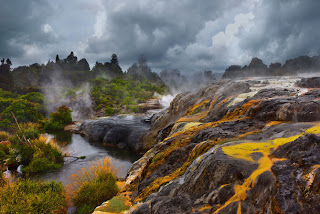
Travel: I love this photo because of the colors, and the environment. The dark blue versus the green trees and then the yellow moss on the black rock really appealed to me. To me it shows forces against each other.

Fashion: This photo really appealed to me because of her eyes. They are very vivid and colorful compared to the whiteness around her face, and even in her face.

Family & Friendship: When I saw this photo it made me think of the connection I have with my best friend, and so I connected it and it became my favorite.

Portraits: There was something extremely mysterious about this photo. It reminded me of the cover of a book I have called Invisible Man by H.G. Wells, and it also reminded me of a comic book character Rorschach.

Documentary: I really enjoy this photo because it shows the man in the wheelchair and his difficult task of the modern London bridge. It may be a journey he frequently takes, but it shows his daily challenge.

Gardens & Plants: My favorite colors are warm ones such as the reds, oranges and yellows in the flowers. I believe it contrasts well with the green grass and green trees, and gives a mysterious effect to the stones in the background.

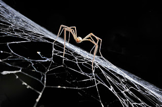
Wildlife: Spider's main base and place to be is their web, and this photo shows the creation of this spider's web, as he creates and connects the pieces, creating his always unique pattern.


Creative License: I really enjoy this photo because of the effect of the light and the place it is set in. The tunnel and the man at the end of the tunnel shows the man, producing the light. The square wave of light is particularly interesting because of its shape compared to the circled rays.

Action & Movement: When I see an action in my head, I always seem to instinctively take a snapshot of the action, mid-swing. When I think of free running, I often think of a jump like this. This was my favorite from this category because of how the photographer was able to capture his jump.

Monday, November 21, 2011

Ethics in Fashion Photography

1) In the computer, the model's head was raised in position from her neck. Her eyes were made bigger and more blue. Her lips are made bigger and the rest of her face is made to be narrower, as well as her shoulders brought together to give a slimmer look.

2) I don't think it is ethically acceptable to change a person's appearance even for a fashion advertisement, because it conveys a false set of results using a particular product.

3) It would be more ethically wrong if it was for a competition between competitors, or it would be more wrong if it depicted a piece of evidence.

4) Small changes such as adjustment to the lighting or the clearness of the photo would be okay to manipulate. If its to be used to be a piece of art, whether to convey a story or show cool effects, there is more you could change.

5) Fashion photography is specifically supposed to advertise a product, or the result of using a product. Photojournalism depicts and gives visual aid to real time events, informing and spreading information.

6) Different types of photography have various purposes, and with them varying ethics. I think that purposes to depict and show current events should be very rarely modified. They should only be modified for the subjects to appear clearer so if the photo is unclear. In Fashion, the most real and true result should be depicted of a product. And in an Artistic purpose, than the limits are much broader, in order to show a beauty or a piece of awe with in a photo.

Thursday, November 17, 2011

Photo Manipulation and Ethics

A) The story offers about 4 to 5 stories about doctoring and modifying photos. In each case, it was either to make a situation more appealing, or correct, or even to just make up events. The manipulation has led to people getting fired, Pulitzer prizes being mis-given, or all images being removed. Photo manipulation in important event document journalism is considered wrong, and unethical.

B) I think this kind of work is unethical because it alters real time significances or events, changing the view on history, or the memory of history. Photojournalism and journalism is about reporting and depicting events in a fair and real way.

---

A) I believe this photo is the most unethical because it adds a person who wasn't there before to increase the good reputation for Wisconsin.

B) I believe the doctoring of this photo is the least unethical because the image simply seems darker and the orientation seems further up than the other.

National Geographic Warm-up

This is my favorite photo because of the colors and the effect the sand in the middle gives. Its so detailed and it looks really awe-inspiring. I also have read most of the science fiction series Dune, and this reminds me of the mystic land of the desert planet in the story, as if this picture could be where a hideout for a rebel organization from the book would be hiding out.

I would take pictures of music. Instruments, musicians, performances, or anything that relates to music. I would also take pictures of things like landscapes, and scenes.

Tuesday, November 15, 2011

Abandoned Theme Parks

1) The theme park in Prypiat, Ukraine interests me the most to visit. It was abandoned due to a nuclear meltdown in Chernobyl. I want to visit it because of its limited availability and its brief danger of a nuclear fallout. There is a certain danger appeal to it. I would also want to visit it because if its eerie existence and scarring of abandonment. You can see the history, and it has been slowly taken over by the surviving nature around it.
3) I think other odd places for photography would be
-Scrapyards/Junkyards
-Warehouses
-Abandoned malls
-Old recording studios
-Old unused schools

Junkyard Photography
5) I think It would be fun to do some photography in a junkyard because of the unique objects and things I could find. All kinds of cars, old appliances, new products that have been just thrown away, have all sorts of history. You never know what you could find in a junkyard. I would definitely take photos of cars, lonely tools and mechanical devices. This would all be to capture and put a commentary on our natural instinct to throw things away and not conserve them or use them for other things.

6) I would have to research possible junkyards and scrapyards to take pictures of. Also, I would need to research the time to get there, if its ever open for public use, or if its even accessible. I probably wouldn't be able to do anything with the junkyard unless it was opened. I may encounter a fee to browse and look, and aside from gas there would be little else to pay for.

Wednesday, October 19, 2011

Funny Captions

A polar bear finds himself in a perplexing situation with a plastic hose. The silly polar bear stood and just accepted it.


The large boy is stuck in his chair, head first into the back of the seat. Little big Johnny didn't know what would happen, he was only curious if his head would fit.


Bill McAwesome builds and rides a bike with a wheel of shoes. He decided this would be a cool little project, and a pretty funny photo.

Cool Video

I really enjoyed the video. I think the maker of the video should include other clubs and organizations around the school, like other Fine Arts and Sports, as well as Invisible Children with Battle of the Bands or FFA and other things like that. The videos should be fun and exciting to provide a positive reflection on the year when looking through the yearbook. I suggest the video be in a more fast-paced and exciting speed, maybe even including other music provided from other groups and people as well as clips of our dynamic school.

Monday, October 17, 2011

Warmup, 10/13/11

1) Any digital camera, but a DSLR will work best.
2) The Canon T3 has the ability to shoot bracketed photos in single level increments, 3 bracketed photos per shutter release.
3) We could shoot an HDR photo of one of the trees in the courtyard, or maybe certain defining features of Akins.

I picked this photo because I thought the subject was interesting and I enjoyed the environment's colors. This photo utilizes aspects of Lines and Balance.

Thursday, October 13, 2011

Fixed Photo Shoot Reflection

1. What did you learn about the camera when you took these photos?I learned more of how all the settings and all of the aspects of a camera's photo can be tweaked and modified. I also learned that light is the most important aspect to photography, because the amount of light will greatly effect a photo.

2. What do you notice about all the photos and the way they look?
Most of the photos I took were dark, and difficult to see. Because of the location, we already had limited light, and so the low ISO setting made it all darker than an evenly lit photo. The other photos we took as a group started to see more of the gradual gradient that we are ought to see.

3. Can you tell the difference between each ISO? Explain how.
In the beginning, the photos are considerably dim and dark. Even the first photo was dark. You could tell immediately that a new ISO setting was in effect when a photo was very obviously brighter in terms of light. By the end, when the ISO was at it's highest, you could see a large majority of the photos, as opposed to the beginning of the photos when everything was much darker.

4. What does this tell you about ISOs and what it does when you change it when you take pictures.

As the ISO setting gets higher in number, the sensitivity to light is increased. As a result, there is generally more light in the photo but since there is more light, the clarity of the photo was also compromised.

5. What about focus? Can you see a difference in the photos? Tell me what differences and similarities you see.

In the early photos, I could see the subjects and the environment very clear. The later photos weren't completely blurred, but it was a bit more grainy with each step, and especially in the end.


6. Post the best photo you took on your blog. Make sure to label the following things: ISO, Shutter Speed, F-stop, Distance, Focal Length, Lighting.


f/4.5     1/125 sec     ISO-3200     7 ft       24mm   Well-lit, Indoors  


7. What do you need to concentrate on when you go out to shoot next time when you have to shoot in Manual setting?

I need to concentrate on my ISO setting, and my shutter speed in order to manage the light in my photo, but I shouldn't use too high of an ISO because I don't want to lose some details.

Great Black and White Photographers Part 3

1) The first thing that caught my eye in the photos by Roger Fenton was the scope of his photos. They tell stories and give a past and future. In the first photo with the dead bombs, it caught my eye that it was in a path way, carved out from a hillside, and that the bombs just laid there with what it seemed to be little action with them. The second photo with the man on the log bridge was the size of the bridge, and the rocky stream below. It showed the man on a large obstacle and terrifying environment.

Photo 1:
I see bombs in a path. Danger and fighting that has occurred. I see the ruins of war.
I smell remnants of gunpowder, fire, and dead bodies. The dirt, rust and the age that the bombs carry with them can be scented.
I hear battle, and war and the vehicles that have passed by hear. I can hear the screams from battle and gunshots. The silence from a land long since ruined by conflict.
I taste blood and dirt from fighting. I can taste military rations and dryness from a lack of moisture. I can taste the dry air.
I feel pain and soreness from worn muscles. From long conflict and struggle I can feel the fatigue. I feel exhausted and heavy.

Photo 2:
I see nature, and a man crossing its gap. The ravine he traverses isn't very deep or wide, but enough to warrant a bridge. I see the cliff face against the stream and the lower plane on the other side.
I smell moisture in the air, as well as the green nature. I can smell the fresh water from the stream as well as the crisp and clean air from the green trees.
I hear water in the stream and birds chirping. The water rushes and babbles as rocks fall. I can her the man's light footsteps and heavy breaths from the narrow walk way.
I taste crisp water and dry travel foods. I can taste sweat from travels to this secluded place.
I feel tiredness from travel, relaxation from its serene tone. I feel the rocks amongst me next to the creek.

I want to show my photographer's world through a power point or maybe a collage of pictures on a poster.

Friday, September 30, 2011

Sim Cam

F2.8 looks best with 1/125th of a second shutter speed.
F4 looks best with 1/125th of a second shutter speed.
F5.6 looks best with 1/60th of a second shutter speed.
F8 looks best with 1/60th of a second shutter speed.
F11 looks best with 1/30th of a second shutter speed.
F16 looks best with 1/30th of a second shutter speed
F22 looks best with 1/8th of a second shutter speed

At F2.8 the background is blurry and indistinguishable while all you see is the couple.
At F4 the background is a bit clearer, and you can begin to see the blackness of the windows.
At F5.6 the background is even clearer and the building outlines are a bit more distinguishable.
At F8 the background is less blurry and just seems to need a bit of focus.
At F11 you can see the buildings and their windows, and you can vaguely see the bricks.
At F16 it is still a bit blurry, leaving out many of the details.
At F22 the buildings are distinguishable and you can see many bricks, as well as a shadow or too from a tree.

At the slower shutter speeds the image becomes bright and blurry, and nothing but a lot of white can be seen in the picture. A photographer needs a steady hand, but I think it takes a great amount of skill to hold a camera still at a speed of 1/8. 1/8 and slower would probably require a stable surface or medium or wielding the camera.

ISO

ISO 200

ISO 6400
1) Shooting sporting events is best with a higher ISO because it will enable the camera to increase the amount of light it takes in which results in a better freeze of an image.
2) A low ISO is best used when there is plenty of light to obtain the greatest amount of detail. Low ISO in dimmer environments will need more exposure time, and moving objects will look like ghosts.
3) Higher ISO was suggested to be used indoors for when light isn't so available, as well as at sports, in order to increase the amount of light that is taken in an image in order to get the best freeze effect.
4) The ISO amounts include an Auto setting, and then 100, 200, 400, 800, 1600, essentially doubling from 100.

Shutter Speed

Fast shutter speed
Slow shutter speed
Blue and Gold Night, before the sun sets
a) Fast shutter speed, 1/3200
b) Fast shutter speed, 1/3200
c) Slow shutter speed, 1/1000
d) Slow shutter speed, 1/1000
e) Fast shutter speed, 1/3200
f) Fast shutter speed, 1/4000

Blue and Gold Night, after the sun sets
a) Moderate shutter speed, 1/2500
b) Moderate shutter speed, 1/2500
c) More Slow shutter speed, 1/500
d) More Slow shutter speed, 1/500
e) Moderate shutter speed, 1/2000
f) Fast shutter speed, 1/3200

In Auto mode, the shutter speed and aperture are automatically set by the camera for the situation.
In Shutter Priority, the aperture is automatically adjusted and the shutter speed is in your control
Manual mode allows you to set the shutter speed, as well as the aperture.

The speeds in the camera range from 1/4000s of a second being the most fast, and the slowest speed is 30 seconds.

Wednesday, September 28, 2011

Aperture

f/2.8
1. What part of the body should we closely relate aperture?
The aperture is most closely related to the eye, the pupil, the iris and the cornea.
2. Finish this sentence - the smaller the Aperture the larger the f-number, the higher the Aperture the smaller the f-number.
3. In your own words tell me how aperture impacts Depth of Field?
A smaller aperture will bring the background into a much better focus, while a larger aperture will have less focus on the background.
4. With the camera near you - tell me the F stops available on the lens currently attached.
The largest f-stop on the Canon EFS 18-55mm is f/22 and the smallest f-stop is f/3.5
f/16

Monday, September 26, 2011

Africa: Black and White

I really liked all the photos in the power point. My initial reaction was, "Wow, these are really great photos. Detail and cool to look at and everything." Than my reaction was concern for how he got so close to the subjects! These photos are really very amazing, and putting them in black and white simplified them and made them more quiet.

My favorite photo is the Lioness Looking Over Plains, the shot of the lioness, sitting and watching the land before here. The sun is in the sky at about 9 o'clock in the morning, and all you can see is the lioness looking at all the plains, as far as the horizon is, and the cloudy day with the sun shining through. Its my favorite because its simple, but beautiful because of the landscape and its focus on the lioness and her land.

Nick Brandt uses a Pentax 6X7 and a few fast prime lenses, such as 75mm, 105mm, 150mm, and 200mm. He shoots in black and white, usually using a red filter to darken the sky. When Nick Brandt began taking wildlife photos, he took them after completing directing for the filming of a Michael Jackson music video. His purpose however isn't to capture wildlife in its most natural form, but to capture what us human people imagine it to be, in a more cinematic format. His hope is to beginning "drawing attention to the plight of Africa's wildlife." He also says "Its all about the long hours and being terrified to walk away for a second just in case that is the exact moment something great happens."


Acedemic Shoot Reflection

1. This assignment was particularly hard to capture. To take photos that told an interesting story and at the same time was simple, aligned or balanced, was a challenge I hadn't taken before. As an amateur photographer before this class, I did not know about the six rules, and just took photos that looked good. But now, instead of a free and open field, I had a prompt, and requirements to fulfill skillfully.

2. I was mostly thinking about keeping it simple, and balanced. I don't think too much about shooting in landscape or portrait format; I usually just shoot in landscape. Rule of Thirds got me thinking about intersecting imaginary lines and how objects have a certain dynamic and focused appeal when shot correctly.


3. I would pay attention to leaving more space to allow action for the subject, avoiding cutting off certain aspects of an image, as well as leaving out other subjects and details unimportant to the frame.


4. This is my first time in a class, and I believe that I have a good grasp on photography, but only a lucky amateur's grasp. I still have a lot to work on but I believe my use of Balance is one of my better traits that I use.


5. Despite its name, the rule of Simplicity is not the easiest, simplest aspect to achieve. Rule of thirds, and Framing tend to be difficult. I think next time Balance and Rule of Thirds are going to be easy for me to complete.


6. Lines requires a very specific path sight line to a subject that will help the viewer identify the subject. Or, Lines also can be a culmination of shapes and patterns found hidden with in the subjects or its surrounding environment. I think this will be the most difficult to accomplish.


7. I'm still not completely clear on the aspect of Lines. I can help myself understand this rule by looking up photos, specific to the rule of Lines.

Thursday, September 22, 2011

Filling the Frame

The extraordinary color of the smoke and the light fill the bottom half of the photo, while the people standing amongst the activity, working and keeping watch. I think this fills the frame with the most activity because of all the interesting color and sparks at the bottom of the frame.

Action and Emotion

The action is a science experiment. Testing the water which concluded into a large explosion and the spread of the water. The emotion is surprise and excitement, intrigue and wonder.